Form Widget
This article will provide details on how to add/edit the Form widget on a web page.
Before we begin, let’s cover a couple of key terms to help you better understand what they’re in reference to as you navigate your way through this article.
- Section(s): the total area, or section, for each widget.
- Container(s): blocks that organize and group content together within a section. Think of them like boxes that hold different parts of a webpage, such as text, images, or videos, keeping everything neat and orderly. For example, the Split Content/Image widget has a block designated for text and a block designated for an image/video; these separate blocks are containers, since they contain the content within the section.
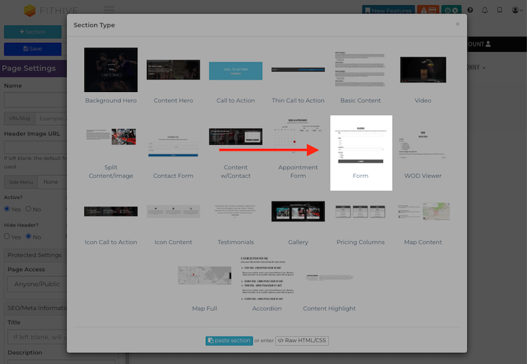
To add this widget to a page, open up the page in your Hive and click +Add Section >> select Form >> then use the settings in the left-hand menu to make your edits, which we’ll cover in more detail below.
FORM
What’s Included/Available: embeds a custom form to the page; please note that the form must be created prior to adding to a page, which you can learn more about in the Custom Forms support article.
Common Uses: embed custom forms to web pages; custom forms can be used for lead capture, lead qualifying, health intakes/questionnaires, surveys, etc.
How to Edit/Settings
- Selected Form: allows you to select which custom form you'd like to add to this page. To edit, click into the field and select the desired form.
- Form Heading: the text added here will be displayed between the Content and the top of the form. To edit, click into the field and add your desired text.
- Form Heading Alignment: controls where the heading text will be aligned, with options being left, center, and right. To edit, click into the field and make your selection.
- Show Form Footer Content: if enabled, this will add an additional content block for footer content, which will be displayed at the bottom of the section. To edit, check the Show Form Footer Content box.
- Form Footer Content: click Edit Content to add the desired content you'd like to be displayed
- Form Footer Alignment: controls where the footer content will be aligned, with options being left, center, and right. To edit, click into the field and make your selection.
- Content: the content added here be displayed at the top of the section. Click Edit Content, then add/edit your content as desired.
- Vertical Padding: controls how much padding (spacing) there is between the content and top/bottom of the section, which you can adjust by using the slider. You can click Default to reset the padding back to its original padding.
- Horizontal Padding by column: controls how much padding there is between the form and the edges of the section, which you can adjust by using the slider.
- Vertical Padding by column: controls how much padding there is between the form and the Heading/Footer content (if applicable). which you can adjust by using the slider.
- Font Size: controls the font size for fields on the form. Use the slider to adjust as desired.
- Heading Font Size: controls the font size of all headings, such as Form Heading, Footer, and Content (if applicable). This does apply towards non-heading text.
- Content Font Size: controls the font size of all non-heading text in the section, but does not apply to the form fields.
- Section Max Width: controls the width of the form and content blocks within the section.
- Form Max Width: controls the width of the form within section.
- Content Width: controls the width of the content (heading, footer, content) within the section, but does apply to the form.
- Content : Form Column Ratio: adjusts the ratio between the Content and Form columns. To see this in action, set the Content Position below to either Right or Left, use the Content : Form Column slider to adjust (this will not have an impact if the Content Position is set to Full or Center).
- Content Position: controls where the content is positioned within the section, with the available options being Left, Right, Center, and Full.
- Column Vertical Positions: these settings control the vertical positioning of the content block and form
- Content: controls the vertical position of the content block
- Form: controls the vertical position of the form
- Button Size: controls the size of the button.
- Button Width: controls the width of the button, with options being Normal and Full.
- Button Position: controls where the button is positioned, with options being Center, Left, and Right.
- Button BG Color: allows to you select the background color of the button.
- Button Text Color: allows to edit the text displayed within the button.
- Background Image URL: this will be displayed behind all content in this section; to edit, click the magnifying glass and select the image you’d like to use, or upload one from your device; you also have the option to select a stock image from the Unsplash Image Library.
- Background Color: to change the background color of the entire section, click into the box and select the desired color; if you’re familiar with color hex codes you can also paste those into the Text Color box.
If you have a background image, you can use the background color setting to overlay a color on top of it; you can also use the transparency slider to make the background color/image more or less transparent. - Text Color: allows you to edit the color for all text within the section.
- Heading Color: allows you to edit the color for all heading text within the section (Heading, Footer, and Content); does not apply to non-heading text.
- Once you’ve finished making your edits to the Form section, click Set Content >> then Save the page to complete the process.
We hope this helps but please feel free to reach out to success@myfithive.com with any additional questions you may have.
Related Articles
Contact Form Widget
This article will provide details on how to add/edit the Contact Form widget on a web page. Before we begin, let’s cover a couple of key terms to help you better understand what they’re in reference to as you navigate your way through this article. ...How to Create a Custom Form
This article will guide you through the steps to set up a Custom Form. Before we begin, please note that a custom form must contain additional fields/info other than basic contact information. If you simply want to collect basic contact information, ...Content w/Contact Widget
This article will provide details on how to add/edit the Content w/Contact widget on a web page in your Hive. Before we begin, let’s cover a couple of key terms to help you better understand what they’re in reference to as you navigate your way ...People (CRM): View Everyone: Forms Filter
This article will show you how to use the Forms Filter in People (CRM) >> View Everyone. This is a convenient way to search for users who filled out Custom Forms or Basic Contact Forms in the event that the form they filled out didn’t have a tag ...Adding a Custom Form to a Web Page
This article will show you how to Add a Custom Form to a Web Page. Before we begin, please note that the custom form must be created prior to adding it to a web page. Additionally, custom forms can only be added to pages that were built through your ...