Call To Action Widget
This article will provide details on how to add/edit the Call to Action widget on a web page in your Hive.
Before we begin, let’s cover a couple of key terms to help you better understand what they’re in reference to as you navigate your way through this article.
Before we begin, let’s cover a couple of key terms to help you better understand what they’re in reference to as you navigate your way through this article.
- Section(s): the total area, or section, for each widget.
- Container(s): blocks that organize and group content together within a section. Think of them like boxes that hold different parts of a webpage, such as text, images, or videos, keeping everything neat and orderly. For example, the Split Content/Image widget has a block designated for text and a block designated for an image/video; these separate blocks are containers, since they contain the content within the section.
To add this widget to a page, open up the page in your Hive and click +Add Section >> select Call to Action >> then use the settings in the left-hand menu to make your edits, which we’ll cover in more detail below.
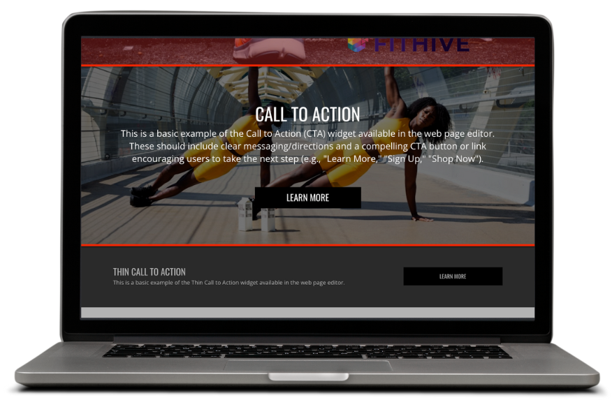
CALL TO ACTION
What’s Included/Available: content element, Call to Action (CTA) button, and background image
Common Uses: encourage visitors to take a specific action, such as making a purchase, signing up for a newsletter, downloading a resource, etc.
How to Edit/Settings
- Vertical Padding: controls how much spacing there is between the content and top/bottom of the section, which you can adjust by using the slider. You can click Default to reset the padding back to its original size.
- Font Size: gives you the option to adjust the size of all fonts in the section, which you can adjust by using the slider. You can click Default to reset the font size back to its original size.
- Heading Font Size: gives you the option to adjust the Head/Title font size, but does not affect the text in the Content. You can click Default to reset the font size back to its original size.
- Style: this gives you the option to select which style the content in this section will be displayed in; the available style options are:
- Page Width: this style sets the content (text) to the left of the section and the button to the right; this also adds padding to the sides of the boundary around the content/button
- Full Width: this style also sets the content to the left of the section and the button to the left, but the padding on the sides is minimal so that the content and button are closer to the outside edges of the section.
- Centered: this style will position the content and button to the center of the section
- Stacked: this style will stack the content on top of the button and is positioned in the center of the section.
- Content: this is where you’ll add the verbiage/copy for your call to action (Buy Now, Learn More, Click Here For More Info, etc); to edit, click Edit Content >> add your desired content >> then Set Content.
- Button Text: this is the text that will be displayed on the button (ex: Buy Now, Learn More, Sign Up Now, etc). To edit, click into the Button Text box and add your text. If you don’t want to include a button, delete the text in the box and it’ll be removed.
- Button Link URL: this is where the users will be redirected to once they click the button; to edit, click the magnifying glass > then select the desired page/membership signup/file. The available link options are broken down into sections, which are:
- Content: includes all custom web pages available in your Hive
- Built In: includes all built-in pages in your Hive, such as member account, class schedule, blog, home page, etc.
- Signup: includes all memberships types that have self signup enabled
- Files: includes all files/images uploaded to your Hive
Button BG Color: to change the button background color, click into the box and select the desired color; if you’re familiar with color hex codes you can also paste those into the Button BG Color setting
Button Text Color: to change the button text color, click into the box and select the desired color; if you’re familiar with color hex codes you can also paste those into the Button Color setting - Background Image URL: this will be displayed in the background of the main content in this section; to edit, click the magnifying glass and select the image you’d like to use, or upload one from your device. You also have the option to select a stock image from the Unsplash Image Library.
- Horizontal Position: use this slider to adjust the background image left, center, or right
- Vertical Position: use this slider to adjust the background image top, center, or bottom
- Background Color: to change the background color of the entire section, click into the box and select the desired color; if you’re familiar with color hex codes you can also paste those into the Background Color setting.
If you have a background image, you can use the background color setting to overlay a color on top of it; you can also use this setting to make the background more/less transparent (example below). - Text Color: to change the color of all text in this section, click into the box and select the desired color; if you’re familiar with color hex codes you can also paste those into the Text Color setting.
- Heading Color: to change the heading text color, click into the box and select the desired color; if you’re familiar with color hex codes you can also paste those into the Heading Color setting.
- Once you have finished editing the content in the Call to Action section, click Set Content >> then Save page to complete the process.
We hope this helps but please feel free to reach out to success@myfithive.com with any additional questions you may have.
Related Articles
Icon Call to Action Widget
This article will provide details on how to add/edit the Icon Call to Action widget on a web page. Before we begin, let’s cover a couple of key terms to help you better understand what they’re in reference to as you navigate your way through this ...Thin Call To Action Widget
This article will provide details on how to add/edit the Thin Call to Action widget on a web page in your Hive. Before we begin, let’s cover a couple of key terms to help you better understand what they’re in reference to as you navigate your way ...How to Create/Edit Web Pages
This article will show you how to create/edit web pages in your Hive. To begin, go to Website >> Manage Web Pages >> Add Page. Before we start adding content, let’s go over the page's primary settings in the left hand menu. +Section: provides a list ...Icon Content Widget
This article will provide details on how to add/edit the Icon Content widget on a web page. Before we begin, let’s cover a couple of key terms to help you better understand what they’re in reference to as you navigate your way through this article. ...Background Hero Widget
This article will provide details on how to add/edit the Background Content widget on a web page. Before we begin, let’s cover a couple of key terms to help you better understand what they’re in reference to as you navigate your way through this ...